The Climate Change dataset from the ESRL/NOAA Global Monitoring Division contains information on various atmospheric factors. The factors focused on in this project are three greenhouse gases: Carbon Dioxide (CO2), Methan (CH4) and Nitrous Oxide (N2O). Data is available on the atmospheric concentrations of these gases from May 1983 to December 2008.
The greenhouse gas measurements are expressed in Parts Per Million by Volume (ppmv). For example, 2000 ppmv of CH4 would mean the concentration will be 2000 millionths of the total volume of the atmosphere.
For all three gases:
A time series will be plotted.
An Auto Regressive Integrated Moving Averages (ARIMA) model will be fitted to forecast values following the end of the time series.
A tab in a dashboard application will be created that can be used to render a plot of a time series with a minimum and maximum forecasted value. This app will be user friendly and will work simply by typing in a number of months to forecast values after the most recent actual value from December 2008.
First of all. a time series for each gas using data from the climate change data set will be plotted.
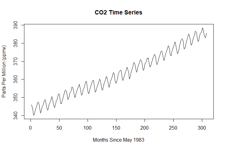
plot(ts(climate$CO2), main = "CO2 Time Series", xlab = "Months Since May 1983", ylab = "Parts Per Million (ppmv)")
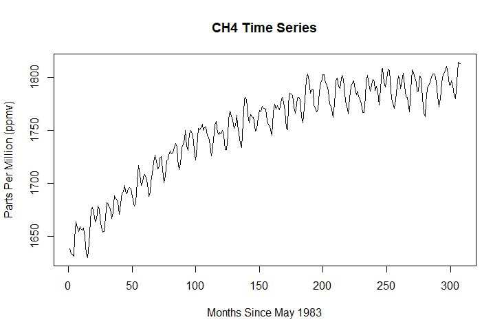
plot(ts(climate$CH4), main = "CH4 Time Series", xlab = "Months Since May 1983", ylab = "Parts Per Million (ppmv)")
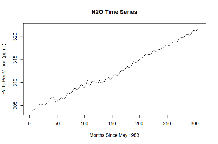
plot(ts(climate$N2O), main = "N2O Time Series", xlab = "Months Since May 1983", ylab = "Parts Per Million (ppmv)")
# Use the ts() command to plot a time series for each gas variable
Time series plots simply display values from a single dependent variable. The X axis always represents time.
In this case the dependent variables are one of three greenhouse gases and the X axis represents the months between May 1983 and December 2008.
An Auto Regressive Integrated Moving Average (ARIMA) model refers to a range of models that can be used to forecast values based on previous values in a time series.
Different ARIMA models can be chosen based on the characteristics of the time series.
The Integration (I) aspect of the ARIMA model forecasts values by using the difference between data values throughout the series rather than the values themselves. This way mean and variance can remain consistent throughout - an important factor involved in predictive modelling.
The Auto Regressive (AR) aspect of the ARIMA model forecasts values based on actual values and their prior values. Stronger AR characteristics in a series refers to the extent that values and their prior or 'lagged' values correlate to one another.
The Moving Average (MA) aspect of the ARIMA model forecasts values based on the interactions between the actual values and the error (AKA residual) values. Stronger MA characteristics in a series refers to the extent that actual values and error values correlated with one another.
All of these aspects amalgamate to create an ARIMA model that forecasts values based on the values and characteristics of a time series.
Different types of ARIMA models are chosen based on whether a time series exhibits stronger AR and/or MA characteritics.
The best ARIMA model can be chosen automatically using a very helpful R function called 'auto.arima()'.
# Fit and store an ARIMA model for each gas variable
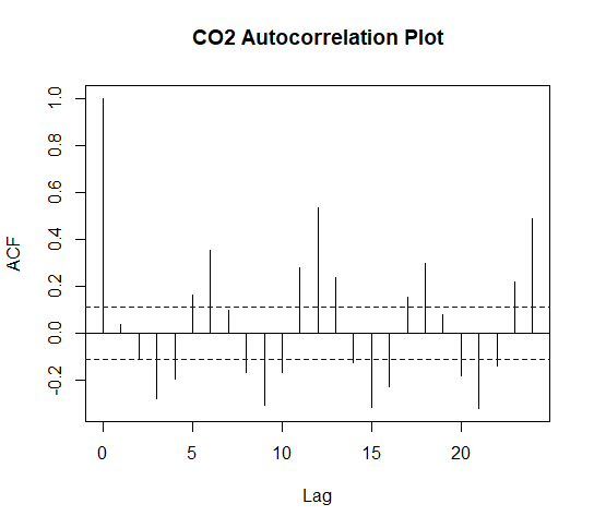
A helpful diagnostic tool to determine the efficacy of an ARIMA model is an Auto-Correlation Function which can be used on the residuals of an ARIMA model.
This will show whether any residual values correlate strongly with other previous/lagged residual values.
If a model's residuals correlate with one another this is a sign that there is something non-random affecting the occurence of the errors and that the model has failed to predict why these values are occuring.
acf(fit.CO2$residuals, main = "CO2 Autocorrelation Plot")
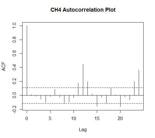
acf(fit.CH4residuals, main = "CH4 Autocorrelation Plot")
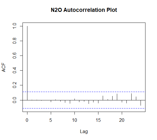
acf(fit.N2O$residuals, main = "N2O Autocorrelation Plot")
# Plot an ACF for each ARIMA model
The dashed lines represent the confidence interval i.e. the threshold the correlation needs to pass for it to be considered signficant. If the spike passes the dash it is a significant correlation.
The correlation at lag zero will always be perfectly positively correlated as the first value is correlated with itsself because at this point there are no lagged values to calculate a correlation.
The other correlations, however, are bad news for this model because not only are there are a number of significant ones but these values pulsate forming a pattern. As previously mentioned patterns in residual values are a sign of poor efficacy in a model.
There are fewer significant correlations in this model and a weak pattern has formed. This is not ideal but does not discredit the model's efficacy too badly.
This plot shows there are no significant correlations between lagged residual values and little to no pattern. This is evidence that this model is an ideal one.
Although the ACF plots didn't show ideal results for the CO2 and CH4 variables, further tests can be conducted to decide whether the model can be used for effective forecasting.
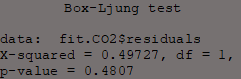
Box.test(fit.CO2$residuals, type = "Ljung-Box")
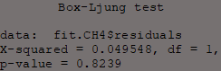
Box.test(fit.CH4$residuals, type = "Ljung-Box")
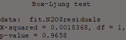
Box.test(fit.N2O$residuals, type = "Ljung-Box")
The Ljung-Box test examines the null hypothesis of independence in a time series.
Here they are applied to the residuals of the ARIMA models to test the extent of independence of its residuals.
In other words the purpose of this test is to determine whether dependency between actual values exists; if this test is significant then this will be bad news for the models.
All Ljung-Box tests have P-values > 0.05 which means the null hypothesis (the series' residuals are independent) is accepted.
This means that the model's errors are random and the model can be used to forecast reliably.
The next step is to start creating the dashboard.
The dashboard is created using the 'Shiny' package and is created by coding two parts, the user interface and the server.
The user interface is what is seen and used by the user and makes up the aesthetics of the app. Most importantly its where the app receives an input.
The server determines how inputs are used and what information is returned.
The user interface will be created first.
library(shiny)
library(shinythemes)
# Import the required packages to create a Shiny dashboard
# This whole block of text is the user interface (ui) code and is essentially just one command with many commands nested within it
ui <- fluidPage(theme = shinythemes::shinytheme("superhero"),
navbarPage(
"Greenhouse Gas Predictions",
# Use the shinythemes() to select the desired theme
# The '::' operator must be used to specify which package the command comes from so that package can be automatically imported while the app is online
# navbarPage() is used to specify the dashboard's main title
tabPanel("Carbon Dioxide",
sidebarPanel(
textInput("txt1", "Insert a number of months to create a forecast period:", ""),
),
h4("Lowest Possible Predicted Value"),
verbatimTextOutput("values1b"),
h4("Highest Possible Predicted Value"),
verbatimTextOutput("values1c"),
h4("CO2 Time Series Plot"),
plotOutput("plotout1"),
) ),
# tabPanel() is used to create a tab within the dashboard - there will be one tab per gas variable
# textInput() places an input field in the user interface so the user can type in a value
# Here "txt1" is the name of the object in which the user's input is stored from the input field
# verbatimTextOutput() returns what ever information taken from the server is stored into the named object - in this case these objects are named "values1a", "values1b" and "values1c"
# plotOutput() will display an output that is stored into the named object - in this case "plotout1" - from the server
# The way these new objects interact with the server will make more sense once the server code has been explained
tabPanel("Methane",
sidebarPanel(
textInput("txt2", "Insert a number of months to create a forecast period:", ""), ),
h4("Lowest Possible Predicted Value"),
verbatimTextOutput("values3b"),
h4("Highest Possible Predicted Value"),
verbatimTextOutput("values3c"),
h4("N2O Time Series Plot"),
plotOutput("plotout3"),
)))
# The code for the CO2, CH4 and N2O tabs are identical other than the variable names and different numbered objects to allow seperate storage of information
Now the user interface has been create the next step is to create the server.
server <- function(input, output) {
climate <- read.csv("climate_change.csv")
# The dataset file name must be specified in this command
forecast::auto.arima( ts(climate$CO2) ), h = input$txt1),
xlab = "Months Since May 1983",
ylab = "Parts Per Million (ppmv)")})
# 'renderPlot()' allows you to display a plot created in R on the dashboard
# Here this command is used to display the plot of a time series with an ARIMA model forecast where h stands for the units of time - in this case months are used
# Here the forecast period is specified as 'h = input$txt1' because it is waiting for a unit of time to be input by the dashboard user
# 'output$values1a' outputs the latest value from the time series (not the forecast model) - therefore this will display the most recent actual value
# This value will be the same no matter what forecast period is input by the user as it represents the latest actual value from the dataset rather than from an ARIMA forecasted value
# The code for each tab are identical in every way other than the variable names and the object numbers
The code for the user interface and server must be saved in seperate R files. These are then uploaded to a server hosted by shinyapps.io along with the dataset file.
The way the inputs are used to create outputs by this dashboard will become much clearer by using it.
Click
here
to see the dashboard (The ouputs will show error messages before a value is entered).