Ozone increases in higher temperatures due to the temperature speeding up the rate of of chemical reactions. Therefore, we are expecting Ozone (parts per billion) and Temperature (Farenheit) measures to have a positive relationship.
Ozone filters Aolar Radiation (measured in Langleys: a unit of radiation named after Samuel Pierpoint Langley), therefore, we are expecting these variables to have an inversed relationship.
The first step in creating the model is to determine whether there is a relationship between the variables. This is done by calculating correlations between the variables; the data must be prepeared before this can be done.
# Check for missing values (NA) in each variable that will be used
NA %in% airquality$Ozone
> [1] TRUE
NA %in% airquality$Solar.R
> [1] TRUE
NA %in% airquality$Temp
> [1] FALSE
NA %in% airquality$Ozone
> [1] TRUE
NA %in% airquality$Solar.R
> [1] TRUE
NA %in% airquality$Temp
> [1] FALSE
The variables Ozone and Solar.R have NAs. Rows of data that have these will need to be excluded so each variable still has same number of values. This is because correlations require all variables are of the same length.
# Create a subset that excludes the NAs
AQ <- subset(airquality, !is.na(airquality$Ozone))
AQ <- subset(AQ, !is.na(AQ$Solar.R))
AQ <- subset(airquality, !is.na(airquality$Ozone))
AQ <- subset(AQ, !is.na(AQ$Solar.R))
The next step is to calculate the correlations between the variables to determine whether the expected relationships exist.
# Call the ggplot package
library(ggplot)
# Use ggplot to create an XY scatter graph with Temp and Ozone variables
xy.temp <- ggplot(AQ)+
geom_point(aes(x = Temp, y = Ozone),
color="purple4")+
labs(title = "Correlation: ",
subtitle = round(cor(AQ$Temp, AQ$Ozone),2))
xy.temp
library(ggplot)
# Use ggplot to create an XY scatter graph with Temp and Ozone variables
xy.temp <- ggplot(AQ)+
geom_point(aes(x = Temp, y = Ozone),
color="purple4")+
labs(title = "Correlation: ",
subtitle = round(cor(AQ$Temp, AQ$Ozone),2))
xy.temp
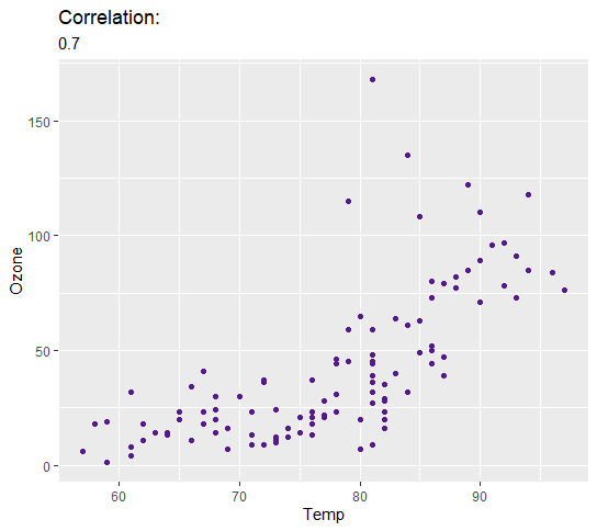
This shows that the correlation between the Temp and Ozone variables is strong. As previously mentioned, temperature catalyses the chemical reaction that produces Ozone so this was expected.
The next step is to calculate and visualise the relationship between the Solar.R and Ozone variables.
The next step is to calculate and visualise the relationship between the Solar.R and Ozone variables.
# Same plot created as before but with the Solar.R and Ozone variables
xy.solar <- ggplot(AQ)+
geom_point(aes(x = Solar.R, y = Ozone),
color="purple4")+
labs(title = "Correlation: ",
subtitle = round(cor(AQ$Solar.R, AQ$Ozone),2))
xy.solar
xy.solar <- ggplot(AQ)+
geom_point(aes(x = Solar.R, y = Ozone),
color="purple4")+
labs(title = "Correlation: ",
subtitle = round(cor(AQ$Solar.R, AQ$Ozone),2))
xy.solar
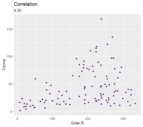
Surprisingly Solar.R and Ozone have a weak positive relationship of 0.35. Although this is unexpected, a model will still be fitted and diagnosed to determine a potential mathematical relationship between these variables.
By doing this, if the model appears to show acceptable diagnostic statistics, despite the variables not showing the expected mathematical relationship, this could lead to a new scientific discovery or at the very least warrant further research into this relationship.
Alternatively, this unexpected finding could simply be due to a flaw in the dataset.
The next step is to check for outliers. Outliers are values that are unusually far from other values in a dataset.
A model fitted with outliers can lead to a model that makes false predictions.
A model fitted with outliers can lead to a model that makes false predictions.
# Create a boxplot for each variable
bp.temp<- ggplot(AQ) +
geom_boxplot(aes(x=Temp),
color="purple4",
width=2,
alpha=0.2)+coord_flip()
bp.solar<- ggplot(AQ) +
geom_boxplot(aes(x=Solar.R),
color="purple4",
width=2,
alpha=0.2)+coord_flip()
bp.ozone<- ggplot(AQ) +
geom_boxplot(aes(x=Ozone),
color="purple4",
width=2,
alpha=0.2)+coord_flip()
bp.temp
bp.solar
bp.ozone
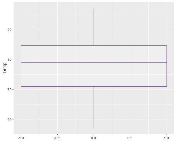
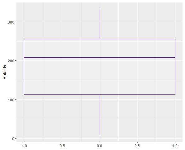
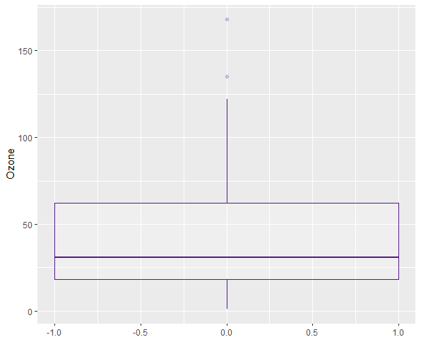
Juding by the boxplots, the only variable with outliers is Ozone. These must be removed.
# Store the outliersn a new object
AQ.out <- boxplot(AQ$Ozone)$out
# Identify which values in the variable are outliers, take them away from the dataset, then store them as a new dataset
AQ <- AQ[-which(AQ$Ozone %in% AQ.out),]
AQ.out <- boxplot(AQ$Ozone)$out
# Identify which values in the variable are outliers, take them away from the dataset, then store them as a new dataset
AQ <- AQ[-which(AQ$Ozone %in% AQ.out),]
The Ozone variable is now outlier free. The next step is to check the distribution of the variables.
To effectively be used in Linear Regression, all continuous (data that can take any value in a specified range - can be infinite) variables must follow a normal distribution (i.e. when plotted must form a bell curve centered around the mean) and not be highly skewed in any direction.
The variables here will be plotted in a density distribution alongside a skewness calculation.
# Call the 'e1071' package
library(e1071)
# Create density plots with skewness calculations for each variable
plot(density(AQ$Temp), main="Density Plot: Temperature",
ylab="Frequency", calculation for each variable
sub=paste("Skewness:", round(skewness(AQ$Temp), 2)))
polygon(density(AQ$Temp), col="purple4")
plot(density(AQ$Solar.R), main="Density Plot: Solar Radiation", ylab="Frequency",
sub=paste("Skewness:", round(skewness(AQ$Solar.R), 2))) polygon(density(AQ$Solar.R), col="purple4")
plot(density(AQ$Ozone), main="Density Plot: Ozone",
ylab="Frequency", sub=paste("Skewness:", round(skewness(AQ$Ozone), 2)))
polygon(density(AQ$Ozone), col="purple4")
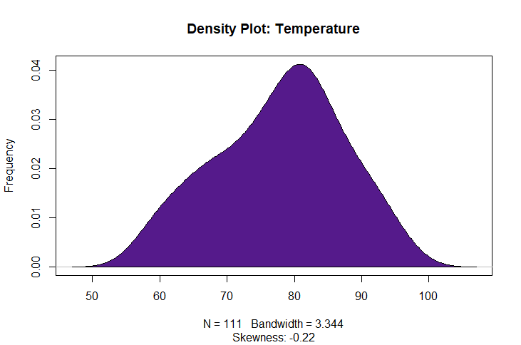
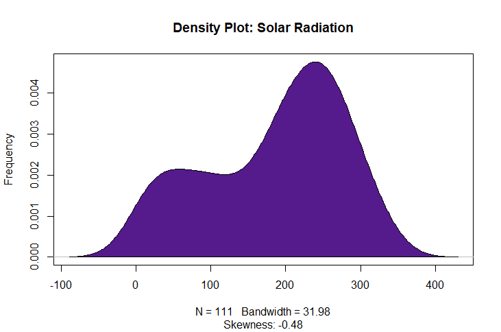
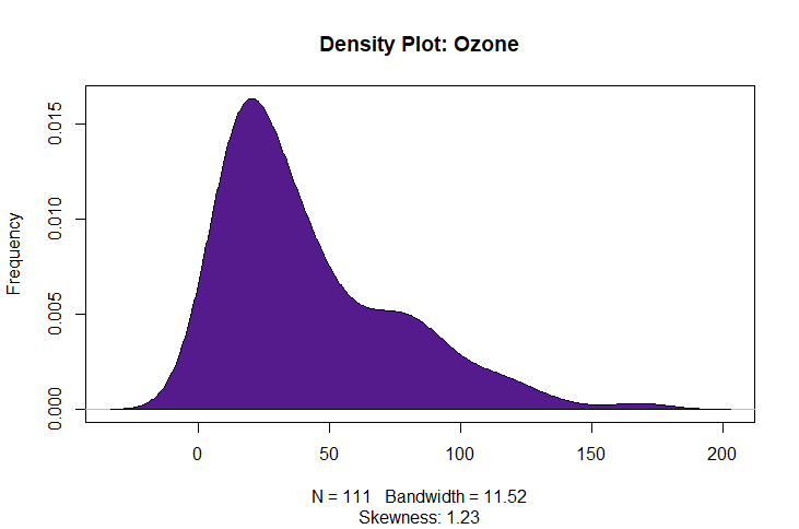
Skewness must fall between -1 and 1 to be considered non-highly skewed.
Although Ozone appears to skew to the left, the skewness calcualation is still below 1 so is appropriate for use in a regression model.
Now that the data is ready to be used in a model, the next step is to fit the model using Ozone as the response variable and both Temperature and Solar Radiation as the predictor variables.
# Fit the model
AQ.lm <- lm(Ozone~Solar.R+Temp,
data = AQ)
# Call the model's summary statistics
summary(AQ.lm)
AQ.lm <- lm(Ozone~Solar.R+Temp,
data = AQ)
# Call the model's summary statistics
summary(AQ.lm)
.png)
The model summary shows the p-values are all below 0.05 suggesting both Solar Radiation and Temperature (predictor variables) significantly affect the amount of Ozone (response variable).
The Estimate column shows the amount of predicted change in Ozone when the predictor variable increases by 1 (in their respective values). So judging by this model, it is predicted that whenever Solar Radiation increases by 1 Lang, Ozone will increase by 0.04470 ppb and whenever Temperature increases by 1 Fahrenheit Celsius, Ozone will increase by 2.22757 ppb.
These paradigms will form the algorithm provided further diagnostics deem the model acceptable for use.
Because the function of the model is to predict values, a R2 value is calculated. this value shows the correlation (%) between the actual values in the dataset and values predicted by the model. Therefore, a higher R2 that is closer to 1, suggests the model is better at predicting values.
This model has an R2 of 0.58 - a model with a R2 of at least 0.5 is generally deemed acceptable for use in scientific research.
The next step is to perform a training/test split, a method that tests the effectiveness of the model.
# Set a seed so that randomly selected samples can be replicated later
set.seed(7)
# Create an index that will select a random 80% of the dataset
train.index <- sample(1:nrow(AQ), 0.8*nrow(AQ))
# Create a training dataset that will use the 80% of the data specified in the index
train.AQ <- AQ[train.index,]
# Create a test dataset that will remove the 80% of data specified in the index leaving 20% of the dataset
test.AQ <- AQ[-train.index,]
# Fit a training model: a model that uses the 80% training dataset
AQ.train.lm <- lm(Ozone~Solar.R+Temp,
data = train.AQ)
# Show the training model summary statistics
summary(AQ.train.lm)
.png)
Even with 80% data, the low p-value suggets Temp is having a signficiant effect on Ozone.
However the p-value for Solar.R is now above 0.05. The training data version of the model has revealed that the statistical effect the Solar.R has on Ozone is not a strong one.
This is unsuprising as these variables were originally expected to have an inverse relationship.
Solar.R will now be excluded from the final model.
The next step is to diagnose the model's ability to predict values.
# Make predictions using the training model paradigms from the corresponding locations in the 20% test dataset
AQ.pred <- predict(AQ.train.lm, test.AQ)
# Create a dataframe where the first column has actual Ozone values taken from the 20% dataset and the second column has values we just predicted
actual.preds <- data.frame(cbind(Actual = test.AQ$Ozone,
Predicted = AQ.pred))
# Perform a correlation between the actual and predicted values
cor(actual.preds)
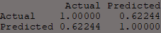
By splitting the data 80/20, the 20% data is different to the other 80%. Therefore, if the real data that is new to the model is similar to predictions made by that model, more confidence can be placed in the model's ability to make predictions if these values are similar.
Here the correlation shows a strong positive 0.62 which suggests the model is effective at predicting true values.
Now to fit the final model without the Solar.R variable.
Here the correlation shows a strong positive 0.62 which suggests the model is effective at predicting true values.
Now to fit the final model without the Solar.R variable.
# Fit the final model
final.AQ.model <- lm(Ozone~Temp, data = AQ)
# Create a visualisation of the relationship between the variables including a subtitle with the important diagnostic statistics from the model summary
final.AQ.plot <- ggplot(aq, aes(y=Ozone, x = Temp))+
geom_point(color = "black")+
stat_smooth(method="lm", color = "purple4")+
labs(title = paste("Adjusted R2 = ",signif(summary(final.AQ.model )$adj.r.squared, 5),
" Estimate =",signif(summary(final.AQ.model )$coef[2,1], 5),
" P =",signif(summary(final.AQ.model )$coef[2,4], 5)))
plot(final.AQ.plot)
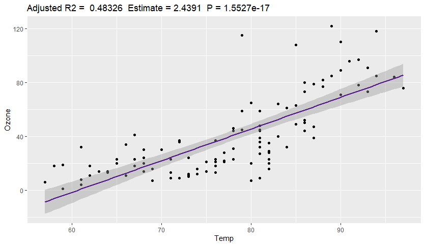
The visualisation shows a clear linear relationship between the variables. This plot shows there is a low p-value and an acceptable R2. Furthermore, the estimated change between the two variables is shown here: for every increase of 1 Degree Fahrenheit there is an estimated increase of 2.4391 ppb in Ozone.
In order to thoroughly test the model and determine its effectiveness, an F-Fold Cross-Validation can be performed on the model which uses a technique similar to the 80/20 split.
When this function is performed, a small fraction of the data is selected randomly and stored into a subset, a new model is built using the larger fraction, then using the predictor variable values from the smaller fraction a set of values are predicted using the paradigms of the model built with the larger fraction.
These predicted values are then plotted with lines of best fit.
# Call the 'DAAG' package
library(DAAG)
# Plot the the K-Fold analysis using the same data and formula as the final model and indicate the number of 'folds' using m
CVlm(data = AQ, form.lm = Ozone~Temp, m = 4)
library(DAAG)
# Plot the the K-Fold analysis using the same data and formula as the final model and indicate the number of 'folds' using m
CVlm(data = AQ, form.lm = Ozone~Temp, m = 4)
.png)
The lines of best fits are all parallel to each other suggesting that in every random sample and analysis, model paradigms similar to the final model are produced.
This provides further evidence for the efficacy of the model.
This provides further evidence for the efficacy of the model.